
What is responsive web design?

Making Your Website Shine Across All Devices
Having a strong online presence is crucial for businesses of all sizes. Whether you're a small startup or a large corporation, your website serves as the digital storefront for your brand. But what happens when potential customers visit your site on a mobile device and find a jumbled mess of tiny text and misplaced images? This is where responsive design comes into play.
What is Responsive Design?
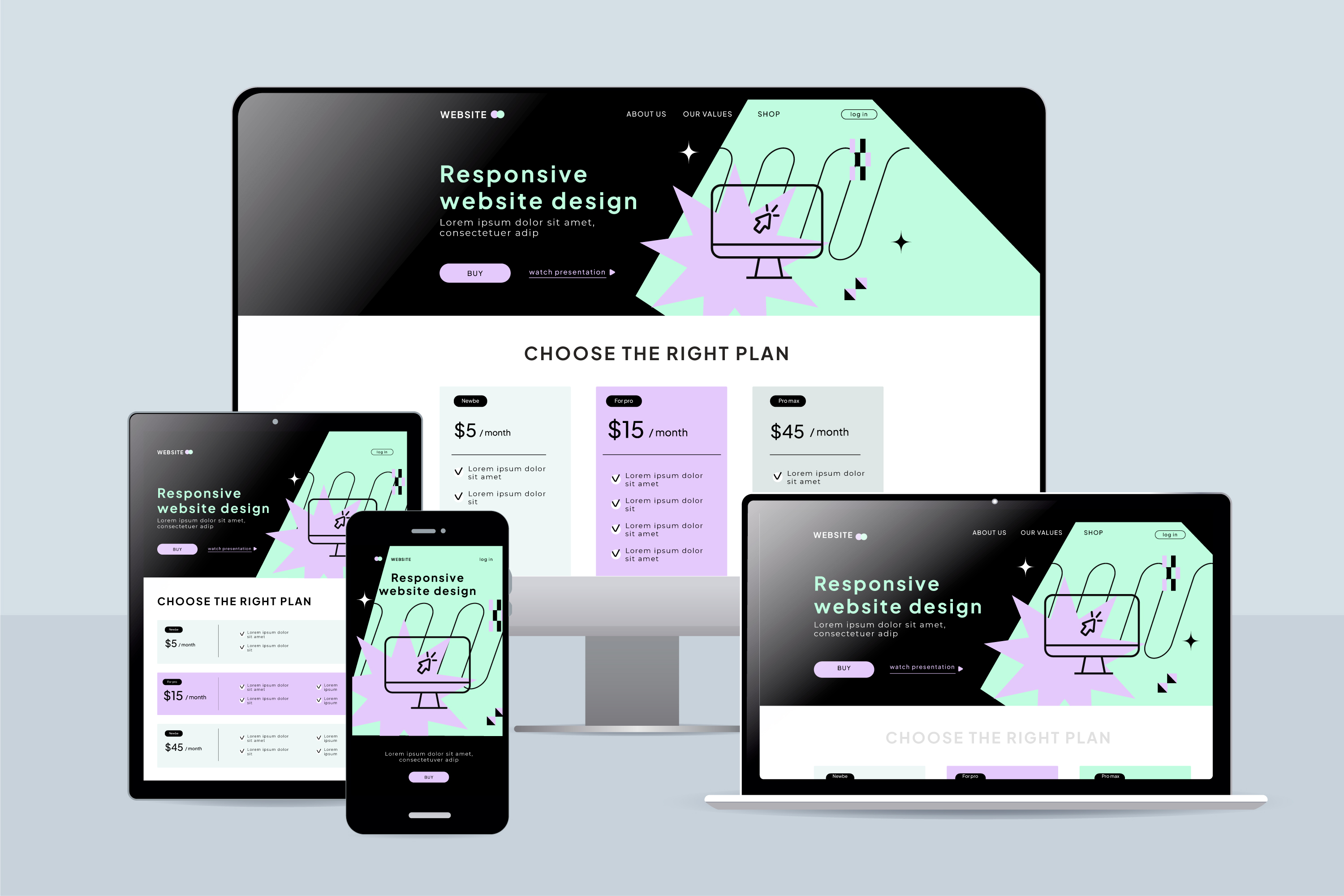
Responsive design is an approach to web design that ensures a website's layout and content adapt seamlessly to the screen size and device type of the user. In simpler terms, it's like having a website that can shape-shift to fit any screen—from the smallest smartphone to the largest desktop monitor.
Why is Responsive Design Important?
Enhanced User Experience: Imagine trying to navigate a website on your smartphone where you have to pinch and zoom just to read the text. Frustrating, right? Responsive design eliminates this hassle by providing users with a seamless and intuitive browsing experience, regardless of the device they're using.
Increased Accessibility: More people are accessing the internet on mobile devices than ever before. By embracing responsive design, you ensure that your website is accessible to a wider audience, including those on-the-go or with disabilities.
Improved SEO Performance: Search engines like Google prioritize mobile-friendly websites in their search results. By implementing responsive design, you not only provide a better experience for users but also boost your chances of ranking higher in search engine results pages (SERPs).
Cost-Effectiveness: In the past, businesses often created separate mobile versions of their websites. However, maintaining multiple versions can be time-consuming and costly. Responsive design streamlines this process by allowing you to manage one website that works seamlessly across all devices.
How to Implement Responsive Design
Now that we've covered why responsive design is important, let's delve into some practical tips for implementing it on your website:
Use Fluid Grids: Instead of fixed-width layouts, use fluid grids that adjust proportionally to the user's screen size. This ensures that your website's elements (e.g., text, images, and buttons) resize smoothly across different devices.
Flexible Images: Make sure your images are flexible and scale proportionally to fit the screen. Avoid using images with fixed widths, as they may overflow or become distorted on smaller screens.
Test Across Devices: Once you've implemented responsive design, it's essential to test your website across various devices and screen sizes to ensure compatibility and functionality.
Media Queries: Media queries are CSS rules that allow you to apply different styles based on the characteristics of the user's device, such as screen width, height, and orientation. Use media queries to adjust your website's layout and typography for optimal viewing on various devices.
/* Example of a media query for adjusting font size */
@media screen and (max-width: 768px) {
  body {
    font-size: 16px; /* Adjust font size for smaller screens */
  }
}
By prioritizing user experience and accessibility, responsive design allows your website to shine across all devices, ultimately driving engagement, improving SEO performance, and maximizing your business's online presence. So, if you haven't already embraced responsive design, now is the time to do so and ensure that your website is ready to meet the needs of today's mobile-savvy consumers.

