How to build a business website? Web design tips for beginners
When building a website, design is paramount. Just like a well-organized store layout, your website's hierarchy guides visitors seamlessly towards their goals. Every element, from clear navigation menus to prominent calls-to-action, plays a crucial role in directing users to take action, whether it's making a purchase or contacting your business. A well-structured website not only enhances the user experience but also communicates credibility and professionalism, laying the foundation for business growth and success. So, when designing your website, remember: structure matters—it's the roadmap that leads users to their destination.
Above The Fold: Your Most Important Content

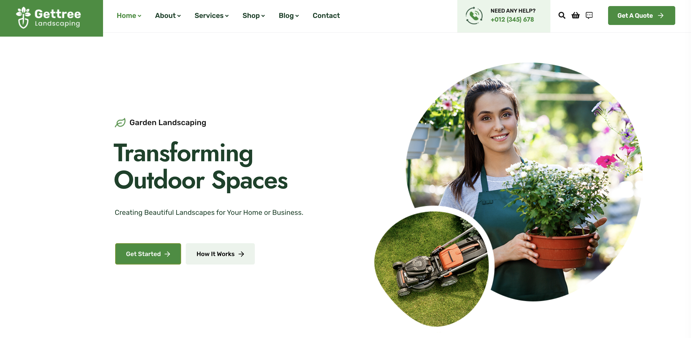
"Above the fold" refers to the portion of a webpage that is visible to users without needing to scroll down. In web design, content that is placed above the fold is immediately visible to visitors when they first land on a webpage, without requiring any scrolling action. It's considered prime real estate for capturing users' attention and conveying key messages, as it's the first thing visitors see upon arrival. Therefore, elements such as headlines, calls-to-action, and important visuals are often strategically placed above the fold to maximize their impact and engagement.
Understanding user behavior online is key to crafting an effective website. While users are adept at scrolling, studies show they spend significantly more time above the fold. This means that capturing their attention with compelling content and your key message in this prime real estate is crucial for engagement and retention.
- Header and Navigation: Start with a clean and uncluttered header containing your logo and a clear navigation menu, enabling users to explore your site seamlessly.
- Hero Section: Follow with a visually captivating hero section featuring a compelling headline, striking image, and a primary CTA (Call To Action). This section sets the tone for your brand and captures visitors' attention immediately. Make sure your main hero section heading has your keywords for what you do.
The Intro: Highlight the Value You Bring

After catching your visitor's eye at the top of your page, what comes next? Well, that depends on what you want them to do! But a smart move is to show them how your business can make their life better. Let's keep the momentum going and highlight the value you bring to the table!
Here are a few suggestions:
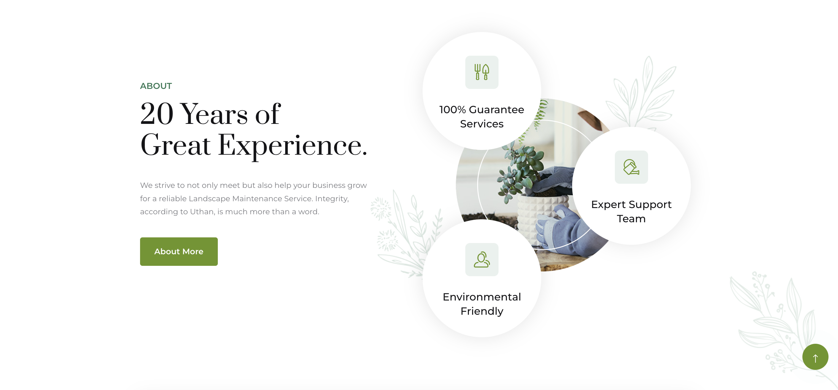
- Why Choose Us?: After grabbing attention with the top part of your page, let's dive deeper into what makes your business special. Highlight why customers should choose you and what benefits you offer. This reinforces why they should stick around and learn more.
- Our Products or Services: Right after the initial eye-catching content, it's time to shine the spotlight on your top offerings. This section lets visitors quickly see what you're all about and encourages them to explore further.
- Reviews: Trust is key to turning visitors into customers. Let's follow up with testimonials, reviews, or success stories from satisfied customers. This builds credibility and shows that others have had a great experience with your products or services.
- Call to Action: Now that visitors are interested and informed, it's time to prompt them to take the next step. Whether it's making a purchase, signing up for updates, or contacting you, a clear and inviting call-to-action (CTA) guides them towards their next move on your website.
The Middle: Showcase What Your Business Is All About

In the middle section of your website, you've got a golden opportunity to really showcase what your business is all about. It's like the sweet spot where you can feature your products or services in greater detail, giving visitors more insight into who you are and what you offer. But it's not just about sharing—it's also a chance to boost your website's visibility in search engines! By adding relevant content and sprinkling in those important keywords, you can help more people discover your website and what you have to offer. So, let's make this middle section shine with engaging content and strategic SEO tactics!
Some suggestions:
- Showcase Your Products or Services:
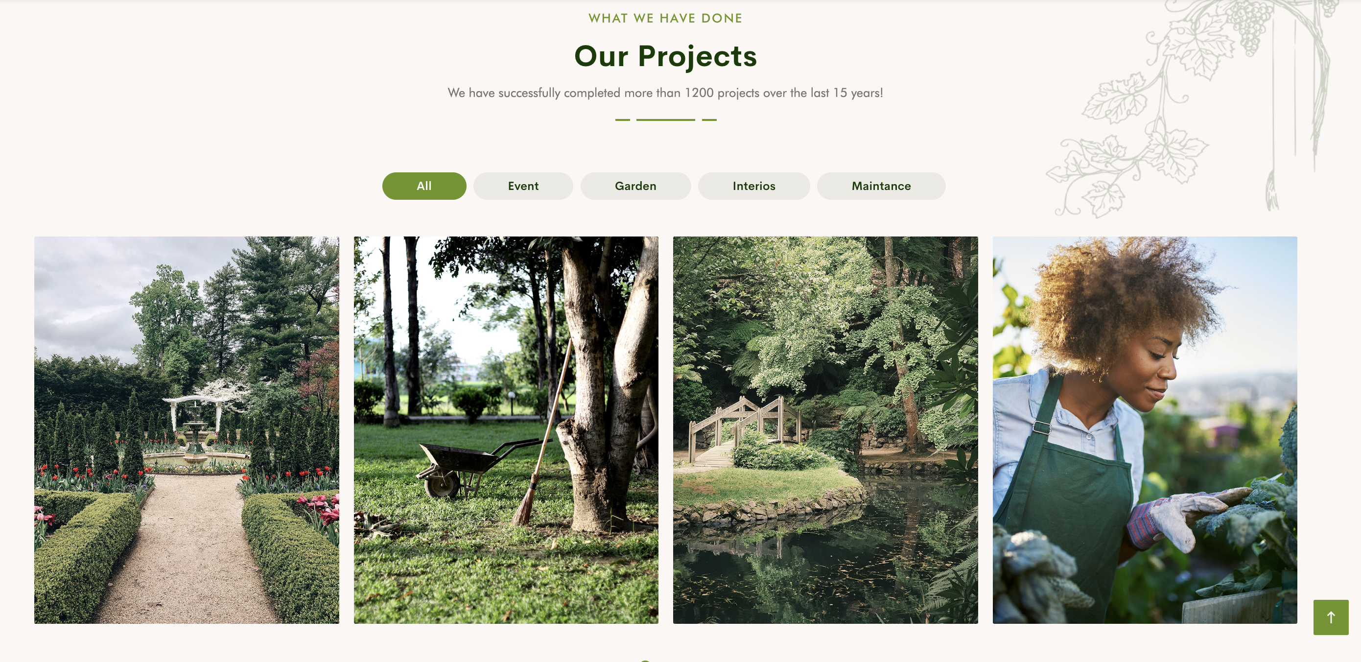
- Provide detailed descriptions and high-quality images to give visitors a clear understanding of what you offer.
- Highlight the key features and benefits that set your products or services apart from the competition.
- Add an image gallery to show off your work.
- Tell Your Story:
- Share your brand's journey, mission, and values to connect with visitors on a personal level.
- Explain what inspired you to start your business and how you're making a difference in your industry or community.
- Include Testimonials:
- Share success stories or case studies that demonstrate the positive impact of your products or services.
- Provide Helpful Resources or Blog Content:
- Offer valuable resources such as how-to guides, tips, or industry insights that align with your audience's interests and needs.
- Create informative blog posts or articles that address common questions or challenges faced by your target market.
The Closing: Final Opportunity to Take Action

At the end of the page, just before the footer, a section dedicated to a strong call-to-action (CTA) is highly effective. This section provides visitors with a final opportunity to take action before leaving the page. Here's why a CTA section is best placed at the end:
- Encourages Conversion: Placing a CTA at the end prompts visitors who have scrolled through your content to take the next step, whether it's making a purchase, subscribing to a newsletter, or contacting your business. This strategic placement maximizes the chances of converting visitors into customers or leads.
- Focuses Attention: By positioning the CTA at the end of the page, you ensure that visitors have had the opportunity to absorb your content and understand the value proposition before being prompted to take action. This increases the likelihood that they will engage with the CTA.
- Provides Closure: The CTA at the end of the page serves as a natural conclusion to the visitor's journey. It gives them a clear direction on what to do next and provides closure to their interaction with your website.
- Optimizes User Experience: Placing the CTA near the end of the page avoids interrupting the flow of content while still making it easily accessible for visitors who are ready to take action. This enhances the overall user experience and ensures a smooth transition to the next step in the conversion process.
The Footer: Providing Essential Information

You've reached the bottom of the page—the footer. While it may seem like the end of the road, the footer is actually a hidden gem packed with valuable information and opportunities. The footer is your final chance to leave a lasting impression on visitors, guiding them to take action and reinforcing your brand identity.
When it comes to footer content, less is often more. Keep it concise and relevant, focusing on providing essential information and guiding visitors towards their next steps.
Here are some key elements to consider when crafting your footer:
- Navigation Links: Include links to important pages such as your About Us, Contact, and FAQ sections. This makes it easy for visitors to find their way around your site, even if they've scrolled to the bottom.
- Contact Information: Provide multiple ways for visitors to get in touch with you, whether it's through email, phone, or social media. This fosters trust and accessibility, ensuring that visitors feel confident reaching out to your business.
- Copyright and Legal Information: Protect your website and intellectual property by including copyright notices, privacy policies, and terms of use. This not only keeps you compliant with legal regulations but also builds credibility with visitors.
- Call-to-Action (CTA): Don't let visitors leave without taking action! Whether it's subscribing to your newsletter, following you on social media, or exploring your latest products, include a clear CTA that encourages engagement.
- Additional Resources: Depending on your business, you may want to include additional resources such as links to your blog, testimonials from satisfied customers, or downloadable assets like e-books or brochures. This adds value to your footer and keeps visitors engaged with your brand.
By prioritizing clear navigation, intuitive design, and compelling calls-to-action, you can create a website that not only engages users but also drives business growth. Remember, your website is often the first impression customers have of your brand, so make it count. With the right structure in place, you'll not only enhance the user experience but also boost your online presence and achieve your business goals.

